If this change is intended to appeal to or draw in new/more visitors to the site and consequently to the philosophy of liberty at the Cato Institute, and succeeds in doing so, then I fully support it from a let-liberty-spread standpoint. Otherwise, if it produces no difference in new traffic to the site, meaning no increased exposure of its content to new people, then I do not like the change.
In other words, if the aesthetic change to the site benefits liberty at the margin, then I could put up with it for the “greater good”, but as far as my personal opinion of it is concerned, I don’t like it.
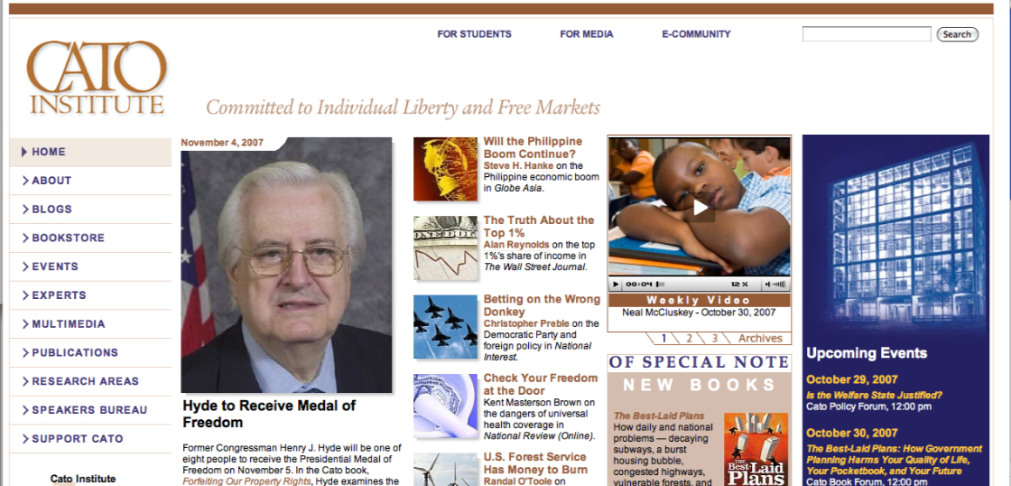
The organization of content was clearer with the old blue and yellow format. Now, it’s slightly more difficult to discern the “daily dispatch” from the “Cato commentary”, for example. Also, few website-related hassles irritate me more than having a site formatted in my browser such that a horizontal scroll bar is necessary in order to accommodate a too-wide display of contentâ??scrolling up and down is fine, but side to side is annoying.
If I am correct, then part of the change was intended to splash the site with more color besides blue and yellow to make it more attractive, which is fine, but I think the organization of content has suffered a bit.
Thanks for posting your observations and opinion about the Cato redesign. We’ll be continuously working to improve the site and add new features in coming months, so feedback like yours is appreciated.
The new design brought with it much more than cosmetic changes. The content most sought by users (or at least most clicked on) was evaluated and given greater emphasis in the new design. The publication pages — as an aggregate the most popular destination on cato.org — are now populated with lists of the most recent related publications, as well as related books.
The online organization of Cato’s extensive research was re-organized and reduced from a bewildering 245 specific research topics to just 83, and the number of clicks required from any page on the site to find resources under those topics was reduced to 2.
The cosmetic problem of having to scroll horizontally is a result of your browser width. The design ‘flexes’ based on the browser widths that we found were most popular with our visitors. Currently, if you’re browser is around 1024-1100px wide, then you’ll see a ‘narrow’ or standard layout. If your browser width is larger than that, a ‘widescreen’ version of the site is activated.
All of these changes are having the effects we desired in terms of interaction design; the statistics we evaluated before the redesign have all shown immediate improvement. However, it should be noted that no site design will attract new visitors. Even if a site were designed by da Vinci, people wouldn’t visit it unless they thought it had something they wanted. For that, we must rely on content in the form of the continued excellent research and commentary from Cato’s scholars, engaging forums and conferences, and the deliberate spread of libertarian ideals by committed individuals.


Very nice, indeed. I had gotten used to the ‘old look’, but this is a welcome change.
If this change is intended to appeal to or draw in new/more visitors to the site and consequently to the philosophy of liberty at the Cato Institute, and succeeds in doing so, then I fully support it from a let-liberty-spread standpoint. Otherwise, if it produces no difference in new traffic to the site, meaning no increased exposure of its content to new people, then I do not like the change.
In other words, if the aesthetic change to the site benefits liberty at the margin, then I could put up with it for the “greater good”, but as far as my personal opinion of it is concerned, I don’t like it.
The organization of content was clearer with the old blue and yellow format. Now, it’s slightly more difficult to discern the “daily dispatch” from the “Cato commentary”, for example. Also, few website-related hassles irritate me more than having a site formatted in my browser such that a horizontal scroll bar is necessary in order to accommodate a too-wide display of contentâ??scrolling up and down is fine, but side to side is annoying.
If I am correct, then part of the change was intended to splash the site with more color besides blue and yellow to make it more attractive, which is fine, but I think the organization of content has suffered a bit.
Vic,
Thanks for posting your observations and opinion about the Cato redesign. We’ll be continuously working to improve the site and add new features in coming months, so feedback like yours is appreciated.
The new design brought with it much more than cosmetic changes. The content most sought by users (or at least most clicked on) was evaluated and given greater emphasis in the new design. The publication pages — as an aggregate the most popular destination on cato.org — are now populated with lists of the most recent related publications, as well as related books.
The online organization of Cato’s extensive research was re-organized and reduced from a bewildering 245 specific research topics to just 83, and the number of clicks required from any page on the site to find resources under those topics was reduced to 2.
The cosmetic problem of having to scroll horizontally is a result of your browser width. The design ‘flexes’ based on the browser widths that we found were most popular with our visitors. Currently, if you’re browser is around 1024-1100px wide, then you’ll see a ‘narrow’ or standard layout. If your browser width is larger than that, a ‘widescreen’ version of the site is activated.
All of these changes are having the effects we desired in terms of interaction design; the statistics we evaluated before the redesign have all shown immediate improvement. However, it should be noted that no site design will attract new visitors. Even if a site were designed by da Vinci, people wouldn’t visit it unless they thought it had something they wanted. For that, we must rely on content in the form of the continued excellent research and commentary from Cato’s scholars, engaging forums and conferences, and the deliberate spread of libertarian ideals by committed individuals.